
Groome-Grooming Platform
As I was working as Ux Designer at Intelligent Software we were approached by a client who wants to create a website for his salon to enable his customers book online but as we discovered that it was a problem that was faced by many salons and people all around the area so we decided to create an app initially a website on which salons can register and people can book the salon online and when they arrive at the booked time they receive their services without delay this was our initial idea but it changes over time read below to know the end product

Company Name
Company Name
Intelligent Software
Problem Statement
In the realm of salon visits, the prevailing chaos of wait times has left users craving a more efficient and respectful experience. We seek to develop an intuitive app that empowers salons to manage appointments flawlessly and allows customers to book with confidence. This solution will prioritize user time, ensuring that appointments commence promptly as scheduled. Our mission: Eradicate salon wait times, transforming the user experience into one of convenience and satisfaction.
User Interviews
Our journey commenced with on-site visits to our local salons, engaging in conversations with both customers and stylists. Through these interactions, we uncovered three distinct scenarios:
1. Case One: We encountered salons with a substantial customer base, but they suffered from time mismanagement and customer dissatisfaction, resulting in customer attrition.
2. Case Two: Another category comprised high-quality salons that often remained underutilized due to the misconception of being expensive. Raising awareness about their affordability emerged as a critical need.
3. Case Three: In contrast, newly opened or struggling salons faced challenges due to their lack of an online presence, among other factors. Customers expressed their frustration, as they desired swift service but were resigned to long waits.
When we introduced our app concept to these customers, they embraced the idea enthusiastically, seeing it as a means to eliminate salon wait times and streamline their experience.
Subsequently, we presented our concept to salon owners and stylists, receiving mixed responses. Some perceived it as a valuable tool to attract and retain customers, while others remained cautious, awaiting evidence of its effectiveness.


Process
Research & Analysis: Following our initial observations, we conducted secondary research to identify existing apps or platforms resembling our proposed solution. However, our findings were significantly limited, with only a few instances of related applications such as yoga apps but no noteworthy online salon management systems resembling our concept.
To gauge public interest and ascertain the frequency of potential users' need for an app specifically for salon bookings, we leveraged social media, particularly Twitter, to conduct polls. The results affirmed our assumptions: people expressed initial enthusiasm for the concept, but it became evident that their interest waned once the booking was completed. Consequently, we shifted our focus toward website development to provide a user-friendly booking alternative without the necessity of app downloads, aligning with user preferences and practicality.
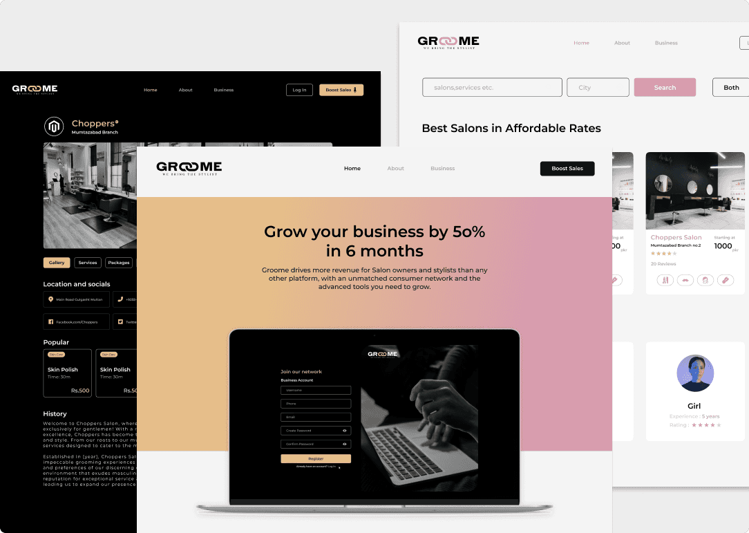
Creating The Brand: In the process of establishing our brand identity, we decided upon the name "Groome," a moniker that artfully encapsulates the core essence of the platform: encouraging meticulous grooming practices for both men and women. Originally, our branding exuded a bold and assertive persona, characterized by a color palette dominated by pure black and bold golden accents. This aesthetic was carefully crafted to resonate with men between the ages of 18 and 50, aligning with our initial target demographic.
However, our journey encountered a pivotal juncture when stakeholders expressed a fervent interest in broadening our scope to encompass women's salons within the platform. This expansion mandated a thoughtful reconsideration of our brand identity.
After rigorous contemplation and a series of creative brainstorming sessions, we arrived at a significant decision: the introduction of two distinct and gender-specific brand color schemes—one tailored to appeal to a male audience and another designed to captivate a female audience. These color schemes were meticulously chosen to resonate with their respective demographics while maintaining an underlying thread of universal elements that unify the brand's identity.
The decision-making process throughout this brand identity evolution was marked by intense scrutiny and careful consideration. While this project spanned a substantial nine-month period, demanding countless hours of dedicated effort, it is my intention to provide a detailed yet concise overview in line with the practices advocated by the renowned UX designer Saptarshi Prakash.
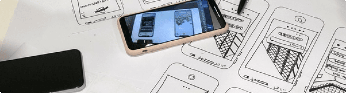
Wireframing & Prototyping: We designed low-fidelity wireframes to visualize the new layout and navigation, iteratively . The problem we faced was with two different themed User interfaces for men and women separately so after brainstorming and going through many sessions with the team we decided to come up with the landing page that has a neutral theme nor men neither women we have to reject other options like giving a pop up once a user lands on Groome but was rejected because pop ups use JavaScript and that is not SEO friendly since Crawler disables JavaScript that means it can't read the pop up and can give bad rating. The platform Groome was designed and developed in a way that we don't have ant pop up models we have used Page Models instead that don't use JavaScript.
High Fidelity Mockup & WCAG 2: While designing Groome we used minimalistic approach to keep the experience as smooth and to reduce cognitive load for users we started with creating our own design system since I prefer my own UI elements rather Than using React Library we have already made wireframes and feature lists and user flows so now it was time to create UI components and high fidelity mockup I always follow the Guidelines of WCAG 2 to make it accessible for all kinds of users with cognitive and physical disabilities to have the same experience as normal users these guidelines also changes my overall perspective of my visual design it has taken out that dribblized touch that I used to have that make it super attractive to normal users but useless to people with disabilities. Along with WCAG I also make sure to follow all UI principles and laws like law of Proximity , Fitts's Law ( Used in the cards of salons on home page) Law of Simplicity ( Used In overall design ) Error Prevention ( Confirmation Dialogs and success messages ) Hick's Law ( Number of salon cards in a row ) Aesthetic-Usability Effect ( Overall Site to hide any functionality flaws ) Law of Mobile-First ( The platform is fully responsive ) Law of Visibility ( Book Now buttons and all important call to actions and interactions were made fully visible ) Law of Readability ( 16px for web and 14px for mobile as a base ) Law of Multi-Platform Consistency ( Same UI elements for male and female same layout contributing to consistency ).
UX Implications In Groome: While designing Groome we did a lot of secondary research along with our user interviews ( Primary Research ) And learned the patterns we can trigger the user to do a certain task in our case the need to have an app like Groome to booking there first salon appointment what were the motivation , triggers and pain points coming in the way of users ( BJ Fogg’s Behavior Model ). We used many UX laws and theories to influence users will be pointed out but the major task we faced was User Retention what is the guarantee that a person will come back to our platform and remember our platform.
Steps Taken Towards User Retention
Simplify Onboarding: Ensure that the initial user onboarding process is quick and easy. Users should be able to start browsing and booking salons within minutes. Keep the registration process minimal, perhaps even offering social media login options for convenience.
Personalized Recommendations: Use of algorithms to suggest salons and services based on the user's past bookings and preferences. This will make the user feel understood and encourage them to return for future appointments.
Push Notifications: Send periodic push notifications to remind users about their upcoming appointment or offer exclusive discounts for their next booking. Used polite language and provide value in these notifications, rather than being pushy.
Rewards and Loyalty Program: Implemented a loyalty program where users earn points or discounts for each booking. This creates an incentive for them to keep coming back to your platform.
Offline Engagement: Organize occasional events or contests that can engage your users offline. For example, you could have a "Best Hairstyle of the Month" contest where users submit photos of their salon-styled hair for a chance to win a prize. This keeps them engaged with your brand even when they're not actively booking.
Feedback Loop: Ask for feedback after each salon visit. Use this feedback to continuously improve the user experience and show users that their opinions matter.
Easy Referral System: Implement a referral system that rewards users for referring friends and family to your platform. This can help you grow your user base through word-of-mouth.
Time-Saving Features: Introduce features that save users time, such as the ability to rebook the same salon and service as their last appointment with just one tap.
Research & Analysis: Following our initial observations, we conducted secondary research to identify existing apps or platforms resembling our proposed solution. However, our findings were significantly limited, with only a few instances of related applications such as yoga apps but no noteworthy online salon management systems resembling our concept.
To gauge public interest and ascertain the frequency of potential users' need for an app specifically for salon bookings, we leveraged social media, particularly Twitter, to conduct polls. The results affirmed our assumptions: people expressed initial enthusiasm for the concept, but it became evident that their interest waned once the booking was completed. Consequently, we shifted our focus toward website development to provide a user-friendly booking alternative without the necessity of app downloads, aligning with user preferences and practicality.
Creating The Brand: In the process of establishing our brand identity, we decided upon the name "Groome," a moniker that artfully encapsulates the core essence of the platform: encouraging meticulous grooming practices for both men and women. Originally, our branding exuded a bold and assertive persona, characterized by a color palette dominated by pure black and bold golden accents. This aesthetic was carefully crafted to resonate with men between the ages of 18 and 50, aligning with our initial target demographic.
However, our journey encountered a pivotal juncture when stakeholders expressed a fervent interest in broadening our scope to encompass women's salons within the platform. This expansion mandated a thoughtful reconsideration of our brand identity.
After rigorous contemplation and a series of creative brainstorming sessions, we arrived at a significant decision: the introduction of two distinct and gender-specific brand color schemes—one tailored to appeal to a male audience and another designed to captivate a female audience. These color schemes were meticulously chosen to resonate with their respective demographics while maintaining an underlying thread of universal elements that unify the brand's identity.
The decision-making process throughout this brand identity evolution was marked by intense scrutiny and careful consideration. While this project spanned a substantial nine-month period, demanding countless hours of dedicated effort, it is my intention to provide a detailed yet concise overview in line with the practices advocated by the renowned UX designer Saptarshi Prakash.
High Fidelity Mockup & WCAG 2: While designing Groome we used minimalistic approach to keep the experience as smooth and to reduce cognitive load for users we started with creating our own design system since i prefer my own UI elements rather Than using React Library we have already made wireframes and feature lists and user flows so now it was time to create UI components and high fidelity mockup I always follow the Guidelines of WCAG 2 to make it accessible for all kinds of users with cognitive and physical disabilities to have the same experience as normal users these guidelines also changes my overall perspective of my visual design it has taken out that dribblized touch that i used to have that make it super attractive to normal users but useless to people with disabilities. Along with WCAG I also make sure to follow all UI principles and laws like law of Proximity , Fitts's Law ( Used in the cards of salons on home page) Law of Simplicity ( Used In overall design ) Error Prevention ( Confirmation Dialogs and success messages ) Hick's Law ( Number of salon cards in a row ) Aesthetic-Usability Effect ( Overall Site to hide any functionality flaws ) Law of Mobile-First ( The platform is fully responsive ) Law of Visibility ( Book Now buttons and all important call to actions and interactions were made fully visible ) Law of Readability ( 16px for web and 14px for mobile as a base ) Law of Multi-Platform Consistency ( Same UI elements for male and female same layout contributing to consistency ).
UX Implications In Groome: While designing Groome we did a lot of secondary research along with our user interviews ( Primary Research ) And learned the patterns we can trigger the user to do a certain task in our case the need to have an app like Groome to booking there first salon appointment what were the motivation , triggers and pain points coming in the way of users ( BJ Fogg’s Behavior Model ). We used many UX laws and theories to influence users will be pointed out but the major task we faced was User Retention what is the guarantee that a person will come back to our platform and remember our platform.
Steps Taken Towards User Retention
Simplify Onboarding: Ensure that the initial user onboarding process is quick and easy. Users should be able to start browsing and booking salons within minutes. Keep the registration process minimal, perhaps even offering social media login options for convenience.
Personalized Recommendations: Use of algorithms to suggest salons and services based on the user's past bookings and preferences. This will make the user feel understood and encourage them to return for future appointments.
Push Notifications: Send periodic push notifications to remind users about their upcoming appointment or offer exclusive discounts for their next booking. Used polite language and provide value in these notifications, rather than being pushy.
Rewards and Loyalty Program: Implemented a loyalty program where users earn points or discounts for each booking. This creates an incentive for them to keep coming back to your platform
Offline Engagement: Organize occasional events or contests that can engage your users offline. For example, you could have a "Best Hairstyle of the Month" contest where users submit photos of their salon-styled hair for a chance to win a prize. This keeps them engaged with your brand even when they're not actively booking.
Feedback Loop: Ask for feedback after each salon visit. Use this feedback to continuously improve the user experience and show users that their opinions matter.
Easy Referral System: Implement a referral system that rewards users for referring friends and family to your platform. This can help you grow your user base through word-of-mouth.
Time-Saving Features: Introduce features that save users time, such as the ability to rebook the same salon and service as their last appointment with just one tap.


Groome Women Prototype
“The art of ruthless iteration can make a product achieve perfection .”

Shahzad Waheed
CEO, Co-founder | Intelligent Software
Research & Analysis: Following our initial observations, we conducted secondary research to identify existing apps or platforms resembling our proposed solution. However, our findings were significantly limited, with only a few instances of related applications such as yoga apps but no noteworthy online salon management systems resembling our concept.
To gauge public interest and ascertain the frequency of potential users' need for an app specifically for salon bookings, we leveraged social media, particularly Twitter, to conduct polls. The results affirmed our assumptions: people expressed initial enthusiasm for the concept, but it became evident that their interest waned once the booking was completed. Consequently, we shifted our focus toward website development to provide a user-friendly booking alternative without the necessity of app downloads, aligning with user preferences and practicality.
Creating The Brand: In the process of establishing our brand identity, we decided upon the name "Groome," a moniker that artfully encapsulates the core essence of the platform: encouraging meticulous grooming practices for both men and women. Originally, our branding exuded a bold and assertive persona, characterized by a color palette dominated by pure black and bold golden accents. This aesthetic was carefully crafted to resonate with men between the ages of 18 and 50, aligning with our initial target demographic.
However, our journey encountered a pivotal juncture when stakeholders expressed a fervent interest in broadening our scope to encompass women's salons within the platform. This expansion mandated a thoughtful reconsideration of our brand identity.
After rigorous contemplation and a series of creative brainstorming sessions, we arrived at a significant decision: the introduction of two distinct and gender-specific brand color schemes—one tailored to appeal to a male audience and another designed to captivate a female audience. These color schemes were meticulously chosen to resonate with their respective demographics while maintaining an underlying thread of universal elements that unify the brand's identity.
The decision-making process throughout this brand identity evolution was marked by intense scrutiny and careful consideration. While this project spanned a substantial nine-month period, demanding countless hours of dedicated effort, it is my intention to provide a detailed yet concise overview in line with the practices advocated by the renowned UX designer Saptarshi Prakash.
Wireframing & Prototyping: We designed low-fidelity wireframes to visualize the new layout and navigation, iteratively . The problem we faced was with two different themed User interfaces for men and women separately so after brainstorming and going through many sessions with the team we decided to come up with the landing page that has a neutral theme nor men neither women we have to reject other options like giving a pop up once a user lands on Groome but was rejected because pop ups use JavaScript and that is not SEO friendly since Crawler disables JavaScript that means it can't read the pop up and can give bad rating. The platform Groome was designed and developed in a way that we don't have ant pop up models we have used Page Models instead that don't use JavaScript.
High Fidelity Mockup & WCAG 2: While designing Groome we used minimalistic approach to keep the experience as smooth and to reduce cognitive load for users we started with creating our own design system since i prefer my own UI elements rather Than using React Library we have already made wireframes and feature lists and user flows so now it was time to create UI components and high fidelity mockup I always follow the Guidelines of WCAG 2 to make it accessible for all kinds of users with cognitive and physical disabilities to have the same experience as normal users these guidelines also changes my overall perspective of my visual design it has taken out that dribblized touch that i used to have that make it super attractive to normal users but useless to people with disabilities. Along with WCAG I also make sure to follow all UI principles and laws like law of Proximity , Fitts's Law ( Used in the cards of salons on home page) Law of Simplicity ( Used In overall design ) Error Prevention ( Confirmation Dialogs and success messages ) Hick's Law ( Number of salon cards in a row ) Aesthetic-Usability Effect ( Overall Site to hide any functionality flaws ) Law of Mobile-First ( The platform is fully responsive ) Law of Visibility ( Book Now buttons and all important call to actions and interactions were made fully visible ) Law of Readability ( 16px for web and 14px for mobile as a base ) Law of Multi-Platform Consistency ( Same UI elements for male and female same layout contributing to consistency ).
UX Implications In Groome: While designing Groome we did a lot of secondary research along with our user interviews ( Primary Research ) And learned the patterns we can trigger the user to do a certain task in our case the need to have an app like Groome to booking there first salon appointment what were the motivation , triggers and pain points coming in the way of users ( BJ Fogg’s Behavior Model ). We used many UX laws and theories to influence users will be pointed out but the major task we faced was User Retention what is the guarantee that a person will come back to our platform and remember our platform.
Steps Taken Towards User Retention
Simplify Onboarding: Ensure that the initial user onboarding process is quick and easy. Users should be able to start browsing and booking salons within minutes. Keep the registration process minimal, perhaps even offering social media login options for convenience.
Personalized Recommendations: Use of algorithms to suggest salons and services based on the user's past bookings and preferences. This will make the user feel understood and encourage them to return for future appointments.
Push Notifications: Send periodic push notifications to remind users about their upcoming appointment or offer exclusive discounts for their next booking. Used polite language and provide value in these notifications, rather than being pushy.
Rewards and Loyalty Program: Implemented a loyalty program where users earn points or discounts for each booking. This creates an incentive for them to keep coming back to your platform
Offline Engagement: Organize occasional events or contests that can engage your users offline. For example, you could have a "Best Hairstyle of the Month" contest where users submit photos of their salon-styled hair for a chance to win a prize. This keeps them engaged with your brand even when they're not actively booking.
Feedback Loop: Ask for feedback after each salon visit. Use this feedback to continuously improve the user experience and show users that their opinions matter.
Easy Referral System: Implement a referral system that rewards users for referring friends and family to your platform. This can help you grow your user base through word-of-mouth.
Time-Saving Features: Introduce features that save users time, such as the ability to rebook the same salon and service as their last appointment with just one tap.
Conclusion
Ready to Elevate Your Project?
Let's bring your design vision to life.
Ready to Elevate Your Project?
Let's bring your design vision to life.